

Working with Maxar Satellite Images in QGIS
Does your satellite image not look as you expected when you open it in QGIS? Is the satellite image not displaying in true colour? Did you ever ask “Why doesn’t my image look correct?

False colour image when you open in QGIS? Doesn’t look correct. A lot of the time users want to see the image in the natural colour.
With QGIS and the way it handles raster images, there are a couple of things you need to know to display the satellite images in true colour correctly.
Maxar Image - True Colour Image Bands
Maxar Satellite Image True Colour Bands are for 8 Band images Red = Band 5, Green = Band 3 & Blue = Band 2
For 4 Band Images the True Colour bands are Red = Band 3, Green = Band 2, Blue = Band 1
You need to set the symbolgy to read the correct bands for the image type you have.
Setting up colour bands in QGIS
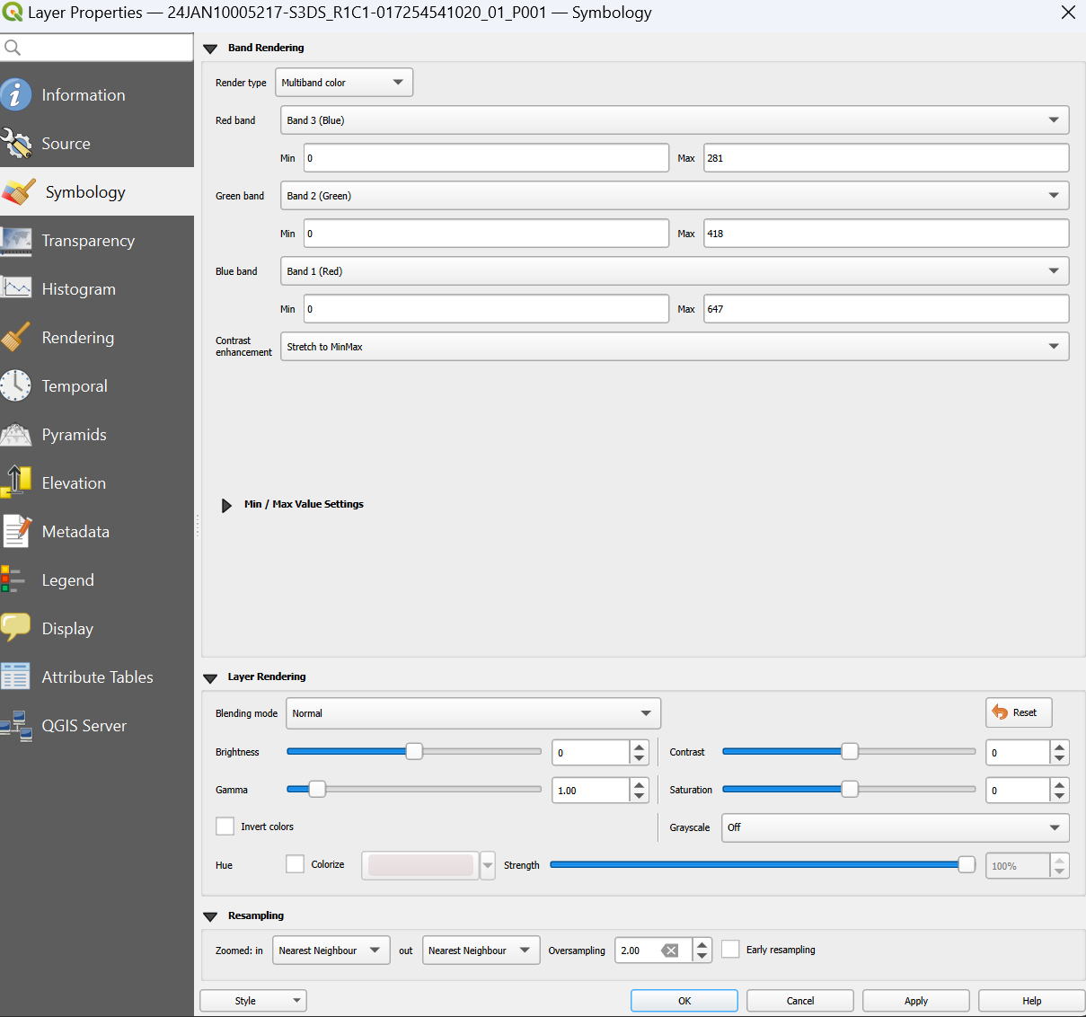
When you add the raster layer in QGIS you need to set the layer symbology bands to the correct RGB band values.
Layer -> Properties -> Symbology
Note* - see the screen shot below. I know in QGIS Maxar image Band 3 says “Blue” & Band 1 says Red but trust me it is not, they are flipped!
3. Set the correct colour stretch.
In the QGIS raster toolbar, select the “local histogram color stretch”. This will display the image in natural colour.
